All About Color
Color Guide
Explore essentials, compass relationships, curated palettes, mood cues, and Vastu shades in one place.
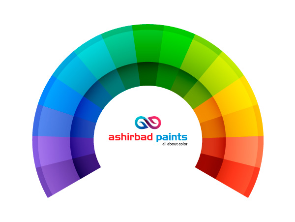
Color Essentials
Build the foundation before you mix.
Color theory is the structure behind every good palette. Start with the core dimensions so you can predict how a shade will read in light, shadow, and finish.
Test swatches on a vertical wall and review them morning and evening. Matte finishes soften a shade, satin enriches it, and gloss adds extra brightness.
- Hue defines the color family.
- Value controls brightness and contrast.
- Chroma sets the intensity from muted to vivid.
Hue
The base color family, from reds to blues to greens.
Value
Lightness and darkness that shape contrast and depth.
Chroma
Intensity that decides whether a shade feels vivid or muted.

Color Compass
Navigate contrast and harmony.
The wheel organizes hues in a circle so you can balance warm energy with cool calm. Use it to create clear relationships across walls, trims, and accents.
Try the 60-30-10 rule: one dominant hue, a supporting tone, and a small accent. Adjust saturation before changing the hue if you want a calmer version of the same palette.
- Warm tones advance and energize.
- Cool tones recede and relax.
- Neutrals connect bold choices.
Complementary
Opposites that add energy and contrast.
Analogous
Neighbors for a smooth, calm flow.
Triadic
Three points for balanced energy.
Tetradic
Two pairs for layered palettes.

Palette Gallery
Pick a lead, then build support.
A strong palette has a hero shade, a supporting tone, and a confident accent. Neutrals help the accent stand out while keeping walls grounded.
Start from fixed elements like flooring, tiles, and furniture. Pull two shades from those materials so the final palette feels deliberate instead of random.
- Lead color across main surfaces.
- Secondary shade for furniture or adjacent walls.
- Accent for trims, niches, or statement walls.
Warm Retreat
Inviting tones for living and dining spaces.
Fresh Coastal
Cool, airy shades for calm interiors.
Urban Modern
Muted neutrals with a bold accent.
Palette Families
Mix shades by purpose.
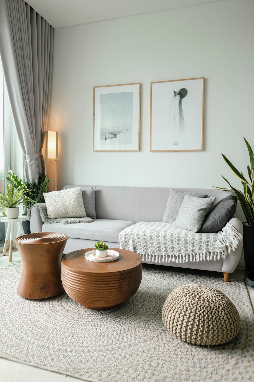
Use warmer families for social areas, cooler families for rest, and balanced neutrals to connect rooms through corridors and open plans.
Color Moods
Color is a feeling.
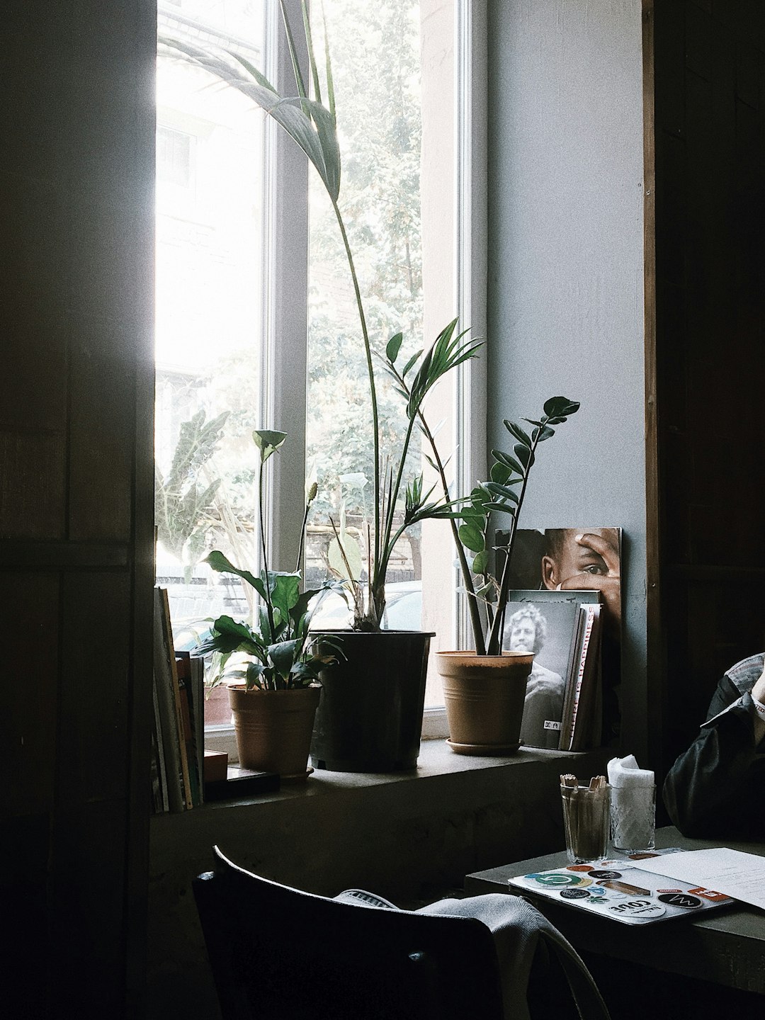
Every shade sends a message. Warm tones energize, cool tones calm, and neutrals create balance. Use psychology to match a space to its purpose.
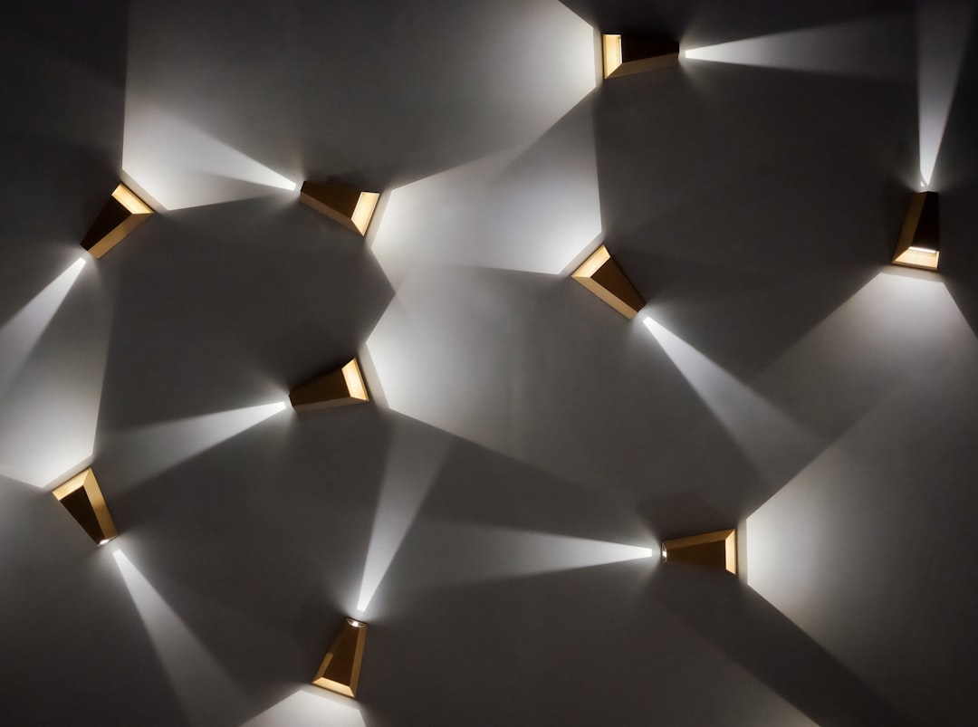
Lighting and texture shape the mood even more. Warm LEDs enrich cozy palettes, while daylight keeps cool tones crisp and open.
- Reds and oranges boost activity.
- Blues and greens support rest.
- Neutrals keep the palette grounded.
Emotional Signals
Pick the vibe you want to live in.
Living Rooms
Balanced neutrals with a confident accent.
Bedrooms
Cool, muted hues for rest and recovery.
Work Spaces
Focused tones that improve concentration.
Retail
Brighter accents to encourage activity.
Vastu Shades
Colors that support flow and comfort.
Vastu Shades blends directional guidance with modern design. The goal is simple: create spaces that feel stable, welcoming, and purposeful.
Match the direction with activity: energizing hues where you move, softer tones where you rest. Keep ceilings lighter to lift the space.
- Use lighter shades to open up a room.
- Add accents to define activity zones.
- Keep transitions smooth between rooms.
North
Fresh greens and soft blues for clarity.
East
Gentle yellows and creams for positivity.
South
Earthy tones and terracotta for stability.
West
Muted blues and greys for calm focus.
Center
Neutrals to keep the space grounded.
Accents
Small highlights to bring energy where needed.
Planning Notes
Keep it practical.
Use Vastu guidance alongside lighting, furniture, and daily routines. Test swatches on-site to confirm the balance before final paint selection.
Create a small sample in each direction and observe it for two days to understand seasonal light shifts before finalizing.